Posts Tagged 'global cooling'

Filthy Dreamers

If you are the President’s chief scientific advisor then you have a duty to be informed and keep informed, and a duty to refrain from making indisputably false statements. Such responsibility is obviously too much for John Holdren, who has shown himself again as an inveterate liar (see earlier posts All who hate Me love Death and Growth of Crops, Weeds, CO2 and Lies). In a recent interview with New Yorker writer Elizabeth Kolbert, Holdren repeats the litany of ‘evidences’ for anthropogenic global warming, which he must know are patently untrue if he has read any scientific literature over the past few years. Holdren said

We all talk about the acceleration of climate change in its impacts that we’re observing. One sees the incidence of wildfires going up more rapidly than people expected, the incidence of heat waves and droughts going up more rapidly, sea level is rising more rapidly… All of these indicators are moving more rapidly.

Wrong on all counts. It’s simply impossible for Holdren to be honestly mistaken here, because the data in some cases comes from US government agencies. Consider sea level rise. There is not the slightest evidence that “sea level is rising more rapidly”, that this represents an “acceleration of climate change in its impacts”. When Holdren says “One sees…” he cannot mean to ‘foresee’ as a ‘seer’ might do, since his previous statement makes it clear that this is one of the accelerating ‘impacts that we’re observing’. Well, it’s really very easy to determine Holdren’s integrity since we can simply look at the data that ‘we’re observing’. Do records show that sea level rise is accelerating, “rising more rapidly”? Not at all: sea level rise has been pretty steady over the last 100 years, except in the last few years when it has appeared to slow down significantly, even to the extent of appearing to show a declining trend since 2006. Wolfgang Scherer, Director of Australia’s National Tidal Facility correctly states

One definitive statement we can make is that there is no indication based on observations that sea level rise is accelerating.
Continue reading ‘Filthy Dreamers’

Arctic Sea Ice Scam

Ever been had? The Observer of July 26 under the engaging title Revealed: the secret evidence of global warming Bush tried to hide makes the following claims:

Photos from US spy satellites declassified by the Obama White House provide the first graphic images of how the polar ice sheets are retreating in the summer. The effects on the world’s weather, environments and wildlife could be devastating.

Graphic images that reveal the devastating impact of global warming in the Arctic have been released by the US military…The pictures, kept secret by Washington during the presidency of George W Bush, were declassified by the White House last week. President Barack Obama is currently trying to galvanise Congress and the American public to take action to halt catastrophic climate change caused by rising levels of carbon dioxide in the atmosphere.

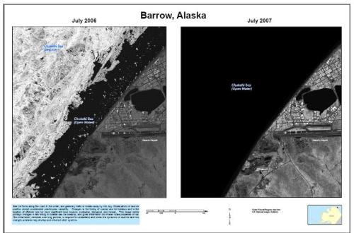
One particularly striking set of images – selected from the 1,000 photographs released – includes views of the Alaskan port of Barrow. One, taken in July 2006, shows sea ice still nestling close to the shore. A second image shows that by the following July the coastal waters were entirely ice-free.

Here are the images

barrow_640x480
We will show in this post that this is a hideous piece of lies and propaganda. It is very revealing since not only does it show the biased propagandizing of the Guardian/The Observer stable, but also demonstrates the crude and shameless progagandizing of the Obama Administration (which also confirms the case made in the post All who hate Me love Death that Obama was dissembling when he claimed that he wouldn’t interfere with science). We will show in this post, with additional evidence from the air and the ground, that the satellite pictures have been deliberately selectively cropped and chosen for maximum propaganda effect to mislead the public (and politicians, no doubt). It is akin to taking beach photographs of low tide one year and of high tide the following year, and putting them side by side in an argument about sea level rise. Put on the finishing touches about a Bush conspiracy and Obama’s openness and you are home and dry with something the Nazis would have been proud of.

Even the University of Alaska, Fairbanks felt compelled to comment:

Annual break-up of landfast sea ice off the coast of Barrow, Alaska received international media attention in July 2009 after the USGS made available high resolution-satellite imagery that show inter-annual variability in coastal ice conditions…However, unlike suggested by some, comparing summer ice conditions in July 2006 and July 2007 is not sufficient evidence to verify a trend.

In other words, all they show is that one year differs from another and no trend can be inferred. In the nicest possible way, this says that someone is up to no good here by distorting the science. Shame on the US Geological Survey for being prepared to become the mouthpiece of propaganda.

Continue reading ‘Arctic Sea Ice Scam’

Climate Robustness

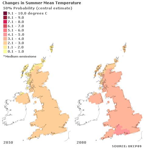
Past behaviour can give very strong indications of just how robust systems are to perturbations and forcings. Applying this to climate, we will take a view on how believable are the UKCP09 projections of warming in the UK over the next 45 years (see the post Met Office Fraudcast). The UKCP09 projections are based on computer modelling. Below are UKCP09 ‘central estimate’ projections for changes in Summer Mean Temperatures (medium emissions scenario) for the UK.

SummerMeanTemp

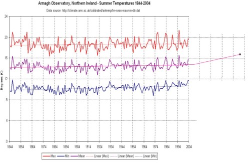
Note that in Northern Ireland the central estimate is for a rise of 2.1 to 3.0 degrees in Mean Summer Temperature in the 2050s (and up to 4 degrees by the 2080s). Temperatures in Northern Ireland have been recorded for over 200 years, and we have a fairly good record covering the last 160 years, see below.

Credit:Junkscience

Credit:Junkscience

It is clear that summer temperatures in the 1840s and 1850s at the beginning of the record were more consistently warm from year to year and averaged higher maximum temperatures than those over the supposedly sizzling last 20 years – maximum summer temperatures never fell below 18 degrees from 1844-1860. The upper red trace represents the daily maximum temperatures during the day (averaged across June, July and August each year), the lower blue trace represents the minimum temperature (at night), and the central purple trace is the mean of the red and blue traces, this being the Mean Summer Temperature. The straight lines through the traces are the trend lines from the values from 1844 to 2004, 160 years. It will be seen that there is practically no trend in the maximum summer temperatures – on average, summers now are not warmer than they were 160 years ago. There is a slight trend in the minimum temperatures – the nights have been getting a little warmer over the period, and who is going to worry about that? Because of the averaging between the max and min traces, this creates a slight trend also in the Mean Temperature, but it is still an extremely minor effect over the 160 year record. Although there have been periods when the mean temperature has been a little higher (the 1840s and 1850s, for example) there have also been periods when it has been a little lower (e.g. the 1870s to 1920s). A definite period is evident when there was a noticeable short-term cooling trend (1859-1884) yet there is no significant long-term trend when considered over the full 160 years (this accords with the observations in 130-year datasets from other parts of the world as indicated in the post Crops and 130 Years of Climate Records).

Yet the Met Office and Defra are now trying to make us believe that a trend line will suddenly ‘kick up’ and take off as shown in the extended part on the right because of mankind’s carbon emissions. It certainly does look fanciful.

Continue reading ‘Climate Robustness’


Archives